Checklist Feed
Improving the visibility of Checklist statuses to create more efficient workflows for admins & managers.
Platform
Web
Role
Product Designer /
Researcher
Delivery Time
2 Weeks

Admins are forced to manually check projects to view progress, which takes significant time and effort.
Admins and managers spend a significant amount of time checking the status of checklists spread across active projects, resulting in wasted time and energy.
From the Project Feed on web, it currently takes multiple steps for users to find relevant checklists on a given project, and even more to navigate back to restart the process on another project.
To ease stakeholder concerns, myself and another designer explored solutions that would take advantage of existing conventions.
The company already had a couple conventions surrounding 'Feed' style pages, namely the Project Feed (or list of all projects) and the Reports Feed (the list of all reports) so we borrowed much of the underlying structure and logic for use with Checklists. This whimsical provided the underlying framework for what eventually became the Checklists Feed.
Credit where credit is due!
I wasn't present for the beginning of this project, so credit to my teammate for getting the conversation started with this early Whimsical iteration.
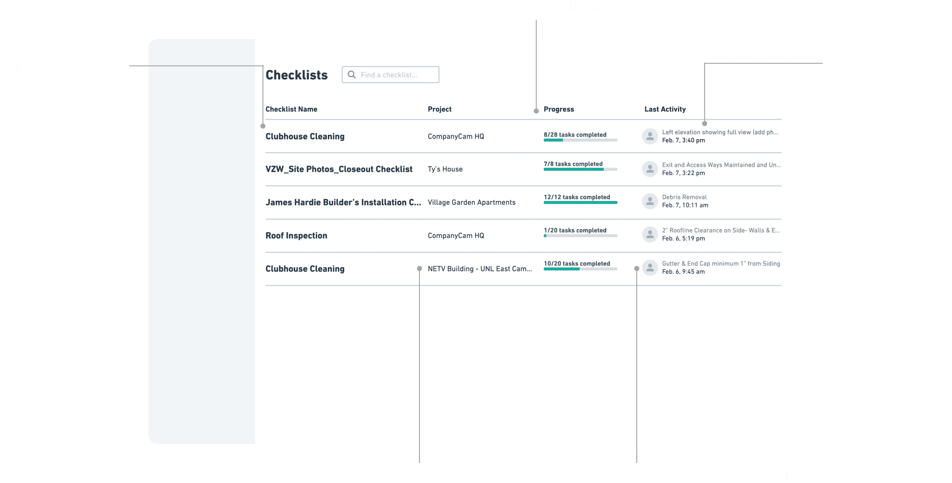
The MVP featured details like the assignee, progress, and recent updates, all of which were of highest interest to users.
There are a couple key differentiators with this feed compared to how it's done elsewhere in-app.
This was the first time we've used a progress bar outside of Checklists to indicate progress. This was a key element for this work, enabling users to see the progress of multiple checklists across projects at-a-glance.
To provide further insight into checklists without forcing users to open them individually, we included a snippet of the latest activity (namely who completed a field last and its title) to give users a high-level look at what's happening inside a Checklist as it actually happens. Typically users would have to click into the various checklists to get a better idea of the latest activity.
Controversial Decisions
One of the more contentious choices made during this project was to bring the project name to the front of each row, deviating from established patterns where the feature name is the unique identifier. Interestingly, 76% of Checklists are made from a pre-existing template, essentially creating thousands of duplicate checklist names that would otherwise interfere with identification of the correct project.
Drawing on earlier input from different areas of the web app, Checklists now launch in a separate tab, ensuring users maintain their scroll position.
This hover-interaction shown below is a direct result of feedback we've gathered from other feeds in our web app.
Specifically, users find it frustrating when content opens in their existing tab, and upon navigating back, they lose their spot due to pagination. To address this concern, I designed a fairly innocuous hover state that not only avoids the pagination issue altogether, but also provides an indication of what's about to happen.
Final thoughts: A quick project that provided significant time savings & value.
This was a great example of a project that only took a couple weeks to implement while improving efficiency for our customers. Some pieces of feedback that we've gathered since shipping this feature:
• Users would like greater customization to sort by different criteria (e.g., show me all the checklists assigned to John Smith)
• Quicker ability to see which users have contributed to a checklist
• Ability to export incomplete checklist into a PDF format to share with stakeholders what still needs to be accomplished
View more case studies

Tasks
By eliminating the need to create elaborate checklists, Tasks offer a quick, visible way of communicating next steps to your future-self or team.

Field Relevance
A project to improve the accuracy and relevance of data input within Checklists.